Helka is getting a makeover – thank you for participating!
In October we organized pop-ups at Kaisa House where participants could view two mock-up versions of Helka's front page, comment on them, and choose their favorite.
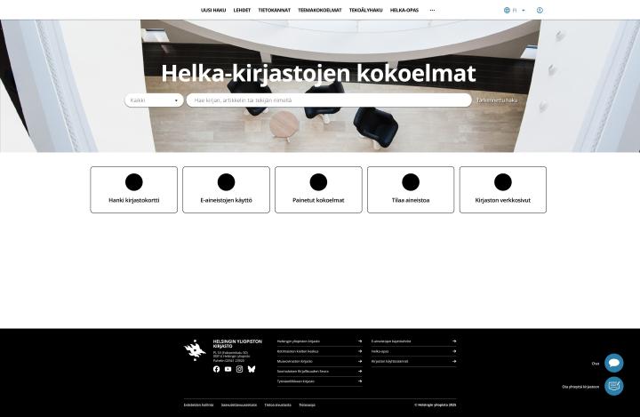
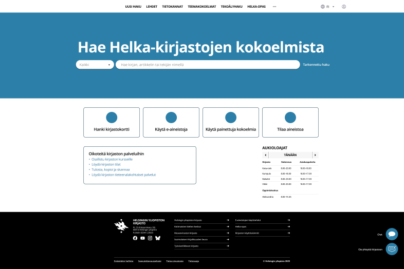
Version 2 is shown above, version 1 at the end of the news item.
What did we learn?
Version 2 turned out to be favourite (336 likes vs. 190). The reason for its popularity seemed to be its contents, as can be concluded from the following comments:
- "V1 is visually more appealing, but V2 has better content."
- "V2's color scheme is too simplistic and looks boring/1990s."
We also asked people to vote for the content they considered important in the mock-up versions. The most popular items were:
- Library opening hours
- Shortcuts to library services
- Clear instructions for using e-materials
Other important points from the comments:
- Login should be easy to find and remain valid for longer
- Ensuring accessibility was considered important
- Artificial intelligence brought up mixed feelings, but Helka's AI search was also praised.
What's next?
A new version of Helka is in the works, and we are designing the content and visual appearance of the front page based on the principle of "V1 visual appearance + V2 content." We have been working on Helka’s accessibility for some time now, so ensuring it is definitely an important part of the renewal.
In early spring, you will be able to try out Helka's new front page and all other features in a test version. So stay tuned and let us know what you think! Your feedback will help us improve Helka.